This website uses cookies so that we can provide you with the best user experience possible. Cookie information is stored in your browser and performs functions such as recognising you when you return to our website and helping our team to understand which sections of the website you find most interesting and useful.
Top 10 INFLUENTIAL Graphic Design Trends for 2018
Trends of the past are making a comeback in web and print design with an innovative and modern flair. As the era of high-wasted jeans and big sleeves make their way out of storage or into fashion magazines, 2018 will be the year of revitalizing old trends into modern and contemporary graphic design. With a world of a thousand distractions, it’s time to differentiate and take a chance with bold type, attention-getting color and extraordinary simplified animated GIFs. Discover the 10 influential graphic design trends that will make an impact in 2018 below.
1. Gradients
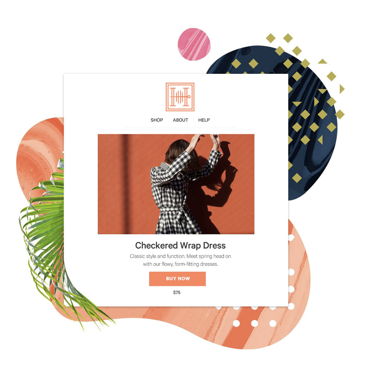
In 2018, last year’s flat and minimal design evolves into one with brilliant color. The once shunned gradients are making a come back, but in a more unique way. They are being added to minimal design combined with flat color to portray a modern feel. Whether it’s a gradient background to highlight a new product or a duotone image with a gradient overlay, bold and vivid gradients draw attention and add radiating personality. Choosing color must be done wisely, and matching gradients with an image to create balance can be tricky. Websites such as www.mixpanel.com and www.skype.com offer great examples of gradient color use.
2. Unconventional Color Schemes
Differentiate your product or service with unconventional color schemes – this means going out of your comfort zone. A unique color palette gives you the opportunity to be more expressive, especially when a promotion is competing for consideration. This trend is especially popular on social media where the fight for attention is constant and challenging. Fast Company is taking advantage of a plethora of unconventional colors to diversify themselves and effectively grab your eye.
3. Texture in Print
Print is certainly not dead! In a day and age when fast-paced internet, apps and digital graphics captivate the fingers of the masses, print has a favorable niche in physical touch. The tactile characteristics of paper go beyond what digital can do and designers are taking advantage of innovative techniques available from the paper mill and commercial printers. Textured and recycled paper, embossing, foil, high gloss and spot varnishes bring an extra element of curiosity to otherwise everyday pieces. Handing out a business card that not only gets remembered, but saved is the ultimate objective.

4. Meaningful, Original Imagery
Tired of seeing the typical stock image as you scroll through your social media feeds? Stock imagery sites have made it easy and cost effective to find photography, infographics and icons on the fly. But it also proves risky – you could end up using the same graphics as your direct competition! The benefits of promoting custom graphics can go a long way. One custom graphic can be utilized for multiple uses and in a variety of formats. From large trade show graphics, to social media infographics explaining a process, to packaging or a promo, original artwork communicates more about who you are than any stock image ever could. It’s additionally more authentic and convincing to see real life people using your product or service.
5. Bold + Handwritten Typography
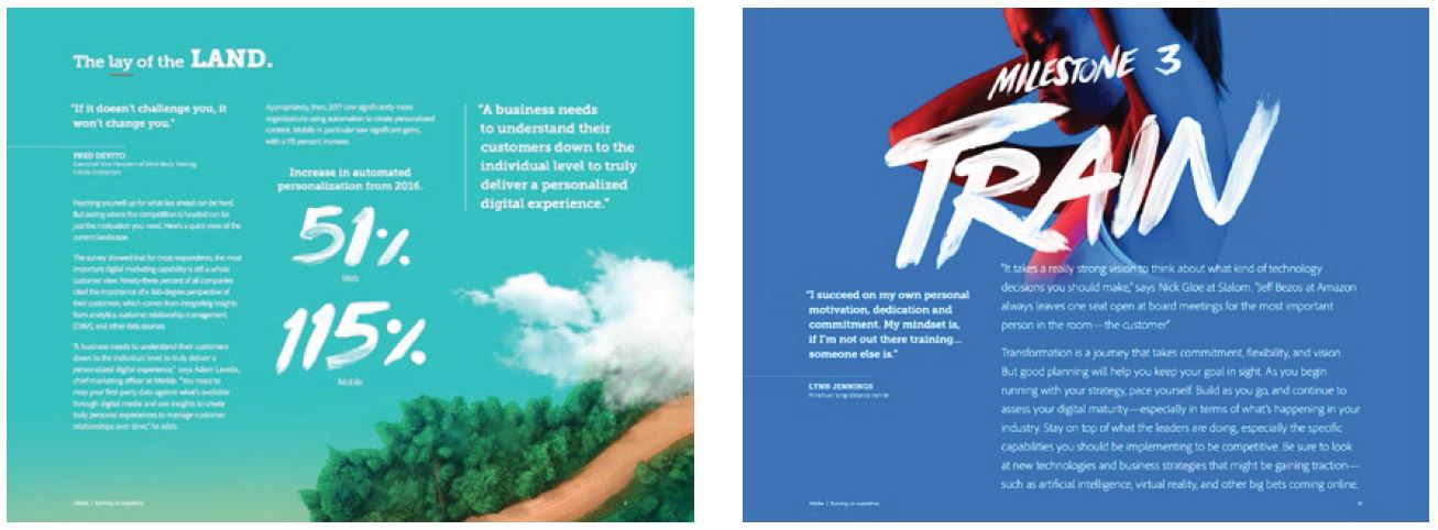
Big, BOLD and fearless typography is dominating news feeds in 2018. Sharp two-three word titles are being used to grab attention, sometimes accompanied by a supporting graphic. Bold fonts can also appear with handwritten fonts for a humanistic approach. Using handwritten quotes within case studies quickly helps the reader relate to the topic and breaks up mundane body copy. Sometimes even just one well-chosen word in handwriting combined with BOLD type calls attention to something that might spark a reaction. Think about your audience, message and purpose when determining when and where BOLD and handwritten fonts are appropriate.
Check out this Digital Marketing Report by Adobe.
6. Simple Animated GIFs & Cinemagraphs
As we continue to make technological advances in the digital world, people are becoming more and more accustomed to movement on a page vs the static websites of the past. Not only are website visitors more engaged by video, but we are used to seeing all sorts of engaging interactions throughout our digital experience. This includes what are called micro interactions, which are small engagements with the viewer upon some sort of user action, which allows the user to feel more connected with the process they are going through on the website, whether it’s liking a post or making a type of selection. These details help the visitor feel like they have more control over an interface during their experience.
Outside of micro interactions, larger motion graphics are also making more of an appearance. Animated gifs of the past were usually poorly executed and hokey, but these days the graphics are much more crisp and smooth and can be created with SVG’s, or scalable vector graphics. Cinemagraphs are another eye-catching addition to these trendy motion graphics. These are still photos with a repeating video loop for a portion of the image, created with video or animated gifs. They create an interesting contrast of stillness with movement that gives a very striking visual.
7. Geometric Shapes
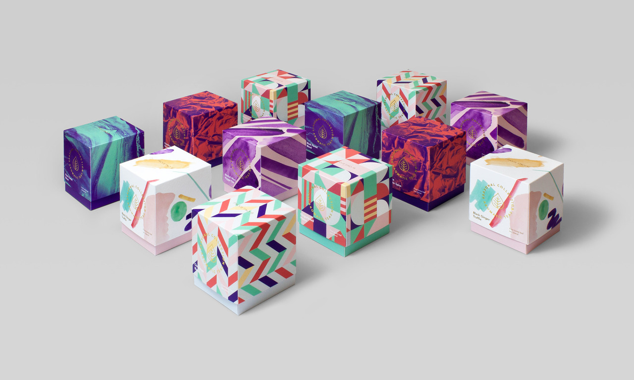
The last few years in design have seen so much simplification, and we are finally coming back around to more daring, dynamic layouts. There is a resurgence in the use of geometric shapes, often with a vintage 80s or 90s feel. These geometric shapes will be used with vibrant colors to explore unique and creative visuals. The popularity of stark, clean pages is being replaced with exciting angles and curves in bright colors.
8. Multi-Color Brand Schemes
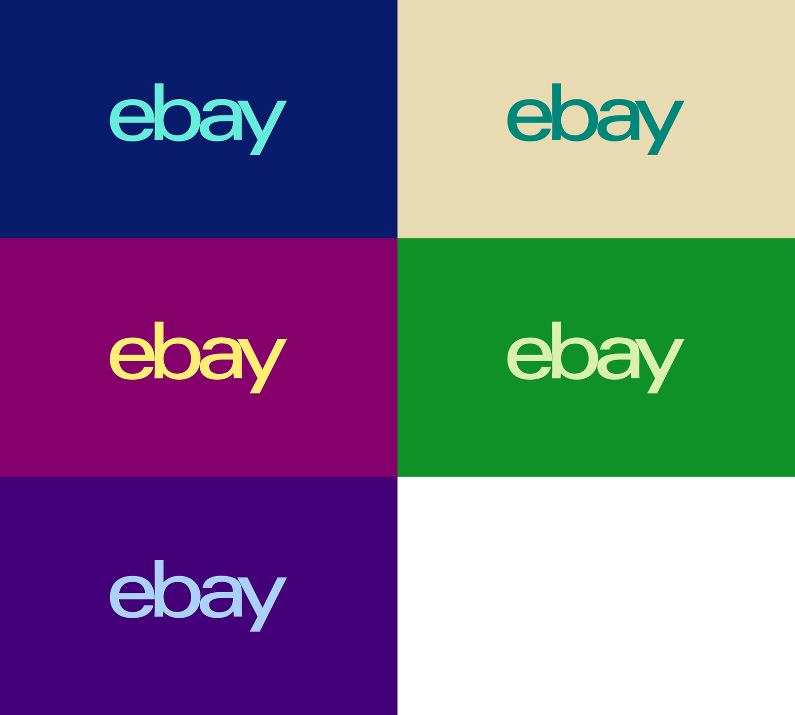
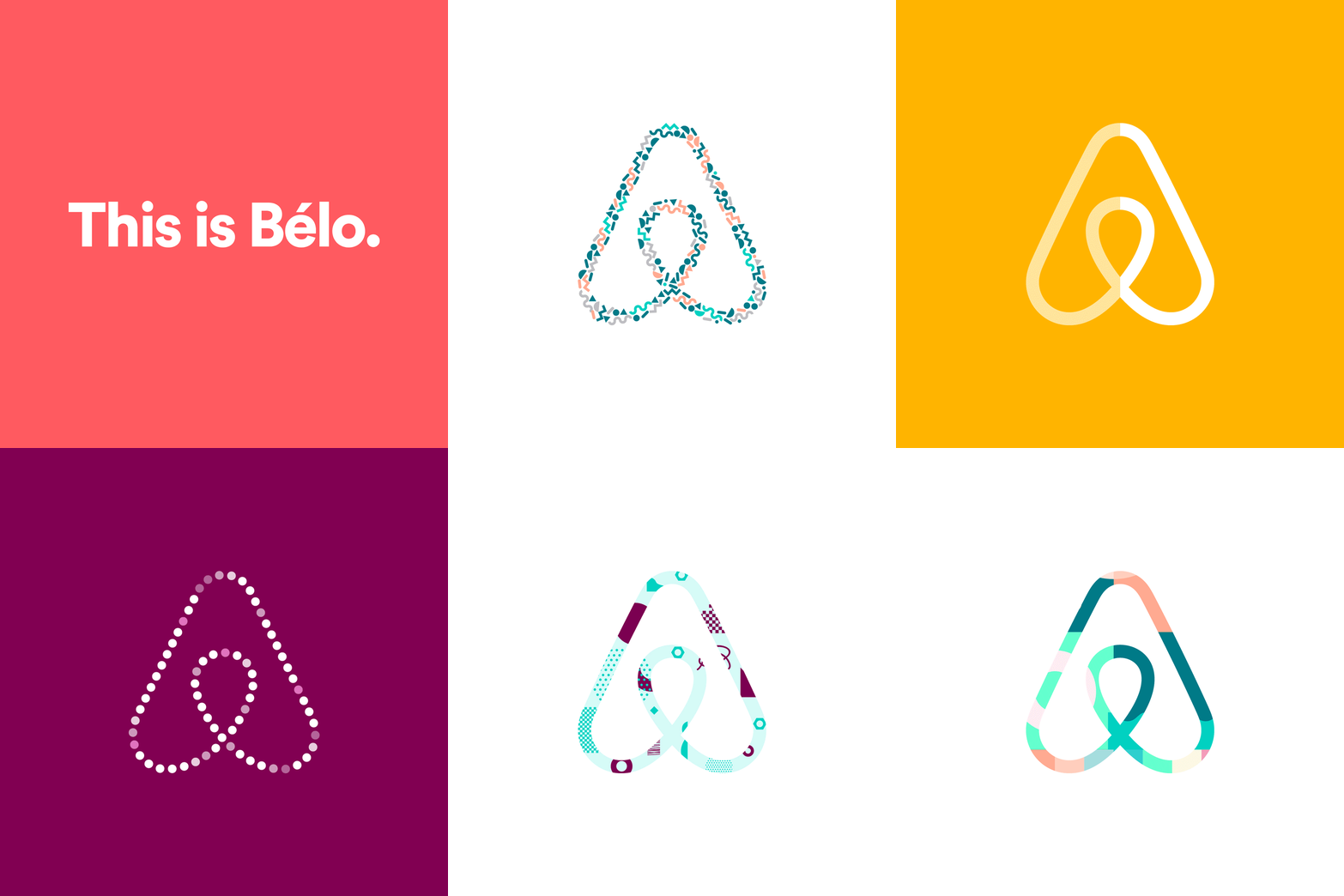
With the new trend in bright colors and motion, companies are exploring taking their brands to another level by giving in to more flexibility when it comes to the logo and brand color palettes. Companies like eBay, dropbox and airbnb have started having more fun with their icons by infusing multiple color schemes and patterns to create more diversity and evoke more emotion with their brand. This trend looks to continue in 2018.
9. Typographic Hero
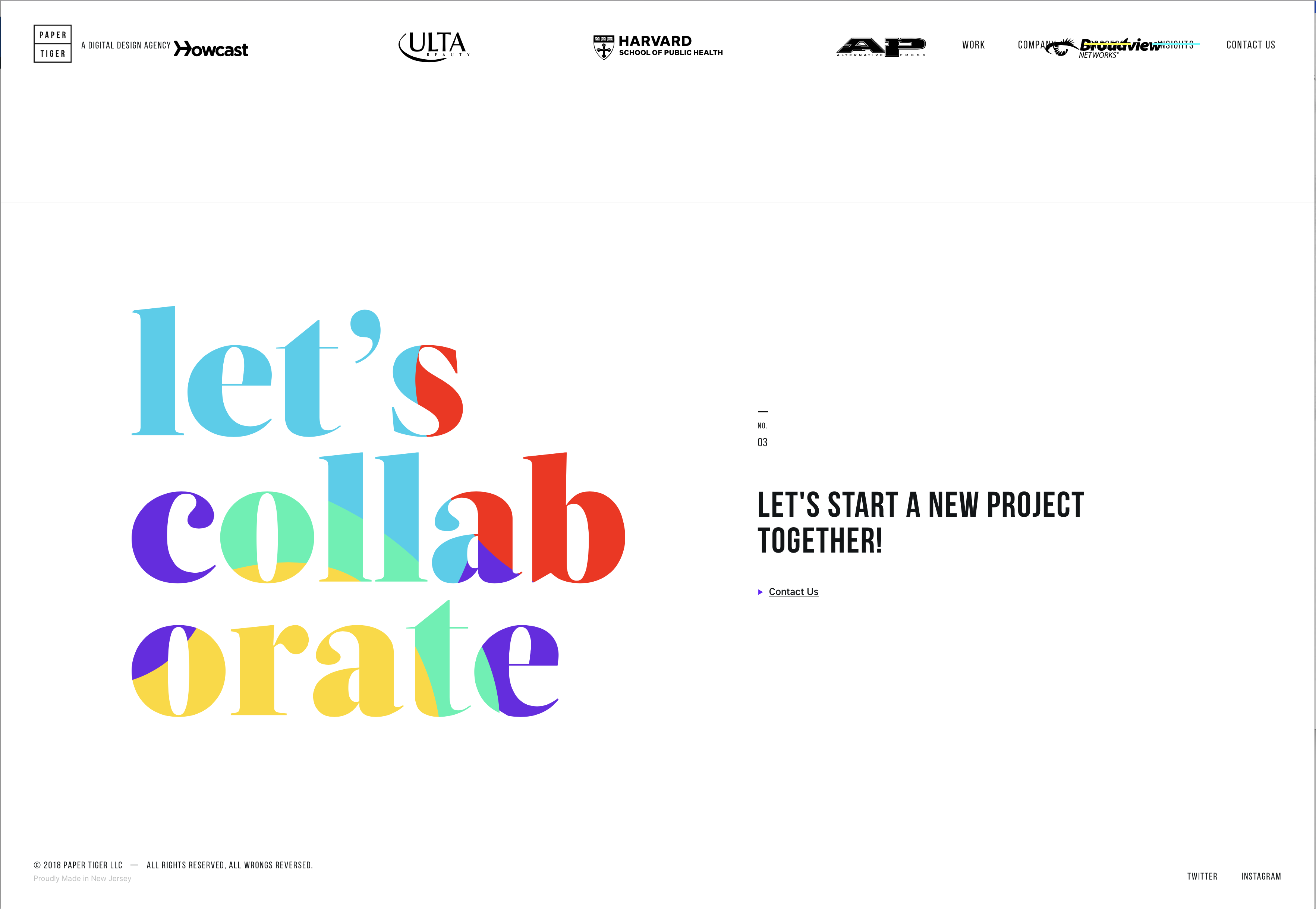
Over the recent years, type has started taking a step into the limelight, becoming the hero in both print and web layouts. With the addition of color fonts, which are open type-svg (scalable vector graphics), any image can now become a letter and can be used to embellish any design. This includes vector shapes, bitmap images or both. This new addition to the font world will continue to flourish in 2018 as more browsers become color-font compatible.
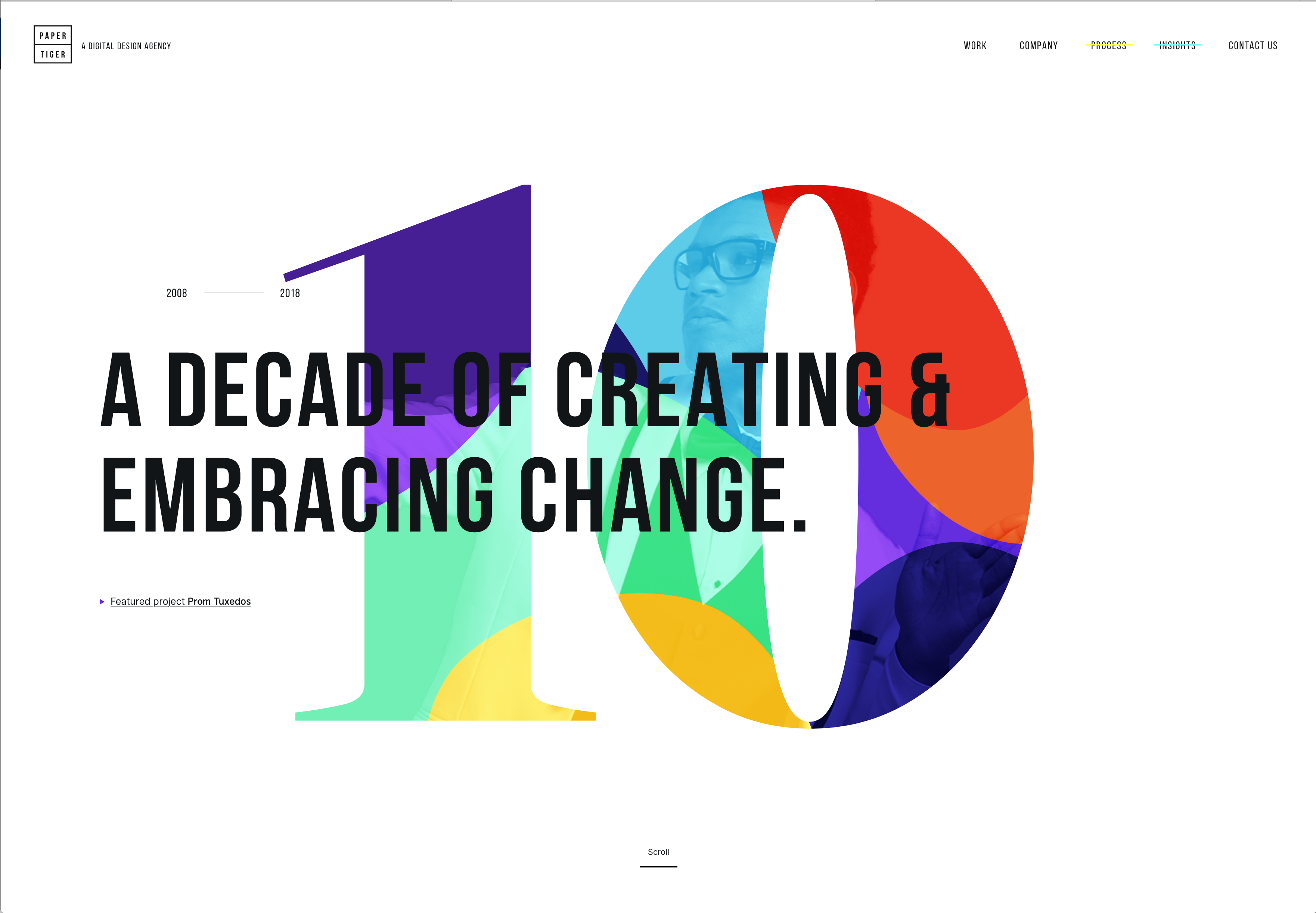
10. Brutalism/Minimalistic Design
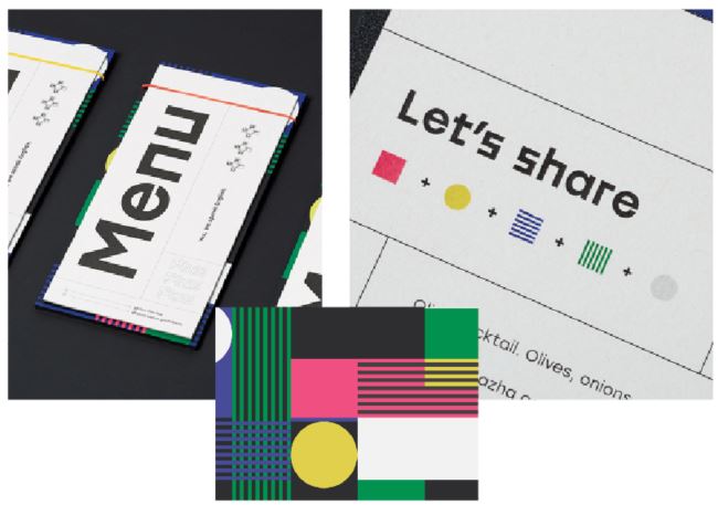
Brutalism is a term originally coined in architecture but has been applied over the years to various forms of design. Recently, this minimal, raw and unpolished look has been making it’s way into packaging, print, and especially web layouts. This is a direct response to the recent years of super clean and organized design. This trend looks to be sticking around for 2018, and provides a unique and more haphazard look.

The world of graphic design is dynamic and it’s an exciting time to watch it evolve and be a part of the change. As trends of the past make their way into our future, we continue to emphasize originality and creativity to stand out. Using professionally designed images and graphics creates a positive impression and avoids misunderstandings. NOW is the time to enhance how you communicate!
This publication contains general information only and Sikich is not, by means of this publication, rendering accounting, business, financial, investment, legal, tax, or any other professional advice or services. This publication is not a substitute for such professional advice or services, nor should you use it as a basis for any decision, action or omission that may affect you or your business. Before making any decision, taking any action or omitting an action that may affect you or your business, you should consult a qualified professional advisor. In addition, this publication may contain certain content generated by an artificial intelligence (AI) language model. You acknowledge that Sikich shall not be responsible for any loss sustained by you or any person who relies on this publication.


